Now there are more post on this subject in this link, you can view all previous posts also .
Now there are more post on this subject in this link, you can view all previous posts also .
Types of Charts
There are several different types of charts and graphs. The four most common are probably line graphs, bar graphs and histograms, pie charts, and Cartesian graphs. They are generally used for, and best for, quite different things.
You would use:
- Bar graphs to show numbers that are independent of each other. Example data might include things like the number of people who preferred each of Chinese takeaways, Indian takeaways and fish and chips.
- Pie charts to show you how a whole is divided into different parts. You might, for example, want to show how a budget had been spent on different items in a particular year.
- Line graphs show you how numbers have changed over time. They are used when you have data that are connected, and to show trends, for example, average night time temperature in each month of the year.
- Cartesian graphs have numbers on both axes, which therefore allow you to show how changes in one thing affect another. These are widely used in mathematics, and particularly in Algebra.
Axes
Graphs have two axes, the lines that run across the bottom and up the side. The line along the bottom is called the horizontal or x-axis, and the line up the side is called the vertical or y-axis.
- The x-axis may contain categories or numbers. You read it from the bottom left of the graph.
- The y-axis usually contains numbers, again starting from the bottom left of the graph.
The numbers on the y-axis generally, but not always, start at 0 in the bottom left of the graph, and move upwards. Usually the axes of a graph are labelled to indicate the type of data they show.
Beware of graphs where the y-axis doesn't start at 0, as they may be trying to fool you about the data shown (and there is more about this in our page on Everyday Mathematics).
Bar Graphs and Histograms
Bar graphs generally have categories on the x-axis, and numbers on the y-axis. This means that you can compare numbers between different categories. The categories need to be independent, that is changes in one of them do not affect the others.
Here is a summary of 'some data' in a data table:| Some Data | |
| Category 1 | 4.1 |
| Category 2 | 2.5 |
| Category 3 | 3.5 |
| Category 4 | 4.7 |
And the same data displayed in a bar chart:
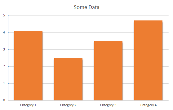
You can see immediately that this graph gives you a clear picture of which category is largest and which is smallest.
You can also use the graph to read off information about how many are in each category without having to refer back to the data table, which may or may not be provided with every graph you see.
In general, you can draw bar graphs with the bars either horizontal or vertical, because it doesn’t make any difference. The bars do not touch.
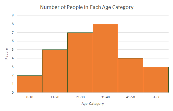
A histogram is a specific type of bar chart, where the categories are ranges of numbers. Histograms therefore show combined continuous data.
Histogram - Worked Example
You have been given a list of ages in years, and you need to show them in a graph.
The ages are:
5, 12, 23, 22, 28, 17, 11, 21, 25, 23, 7, 16, 13, 39, 35, 42, 24, 31, 35, 36, 35, 34, 37, 44, 51, 53, 46, 45, and 57.
5, 12, 23, 22, 28, 17, 11, 21, 25, 23, 7, 16, 13, 39, 35, 42, 24, 31, 35, 36, 35, 34, 37, 44, 51, 53, 46, 45, and 57.
You can choose to group them into ten-year age categories, 0–10, 11–20, 21–30 and so on:
| Age | Number of people |
| 0-10 | 2 |
| 11-20 | 5 |
| 21-30 | 7 |
| 31-40 | 8 |
| 41-50 | 4 |
| 51-60 | 3 |
To show this data in a histogram, your x-axis would be numbered in 10s from 0 to your highest age, your y-axis from 0 to 8 (the highest number of people in any group), and there would be no gaps between the bars, because there are no gaps between the age ranges.
Pictograms
A pictogram is a special type of bar graph. Instead of using an axis with numbers, it uses pictures to represent a particular number of items. For example, you could use a pictogram for the data above about ages, with an image of a person to show the number of people in each category:

Pie Charts
A pie chart looks like a circle (or a pie) cut up into segments. Pie charts are used to show how the whole breaks down into parts.
For example, this data shows the sales figures for a year, broken down by quarters:
| Quarterly Sales Figures | 1st Qtr | 2nd Qtr | 3rd Qtr | 4th Qtr |
| 8.2 | 3.2 | 1.4 | 1.2 |
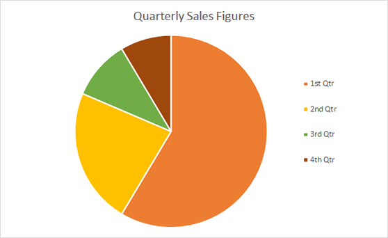
From the pie chart you can see immediately that sales in Quarter 1 were much bigger than all the others: more than 50% of total annual sales.
Quarter 2 was next, with around one quarter of sales.
Without knowing anything more about this business, you might be concerned about the way that sales appeared to have dropped over the year.
Pie charts, unlike bar graphs, show dependent data.
The total sales in the year have to have occurred in one quarter or another. If you’ve got the figures wrong, and Q1 should be smaller, one of the other quarters will have sales added to compensate, assuming that you haven’t made a mistake with the total.
Pie charts show percentages of a whole - your total is therefore 100% and the segments of the pie chart are proportionally sized to represent the percentage of the total.
Usually it is not appropriate to use pie charts for more than 5 or 6 different categories. Lots of segments are difficult to visualise and such data may be better displayed on a different type of chart or graph.
Line Graphs
Line graphs are usually used to show dependent data, and particularly trends over time.
Line graphs depict a point value for each category, which are joined in a line. We can use the data from the pie chart as a line graph too.
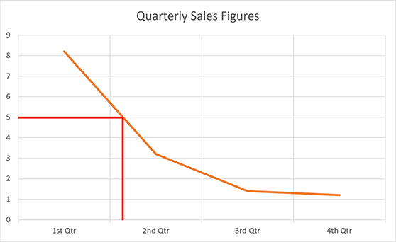
You can see even more obviously that sales have fallen rapidly over the year, although the slow-down is levelling out at the end of the year. Line graphs are particularly useful for identifying the point in time at which a certain level of sales, revenue (or whatever the y value represents) was reached.
In the example above, suppose we want to know during which quarter sales first fell below 5. We can draw a line across from 5 on the y-axis (red line on the example), and see that it was during quarter 2.
(Ref: http://www.skillsyouneed.com/)
(Ref: http://www.skillsyouneed.com/)
For written exam/ interview guidance , you may contact:
ANIL AGGARWAL SIR (P.O.-1982 BATCH)
EX CHIEF MANGER ,PUNJAB NATIONAL BANK.
Mobile: +91 9811340788
E-mail ID: anilakshita@yahoo.co.in
Office: Flat #49, Trilok Apartments, Patparganj, I.P. Extension, Delhi-110092.
Follow us at:
Facebook Page: https://www.facebook.com/AnilAggarwalJobguidancehub
Website: http://bankinterview.in/
No comments:
Post a Comment